-
Modern football branding often feels corporate and disconnected from the supporters who live and breathe the club.
The biggest teams spend an extortionate amount on their image and yet they never feel very striking or memorable. Their identities have become interchangeable, relying on tradition but lacking any emotion or storytelling.
For Swansea City, that meant they missed the opportunity to create something that reflected both the passion of the fans and the grace of the clubs symbol, the swan.
-
A football club’s identity isn’t just a badge, it’s the connection that links fans with their community, to their team.
There was a huge opportunity to reimagine Swansea’s identity into something that felt modern, yet rooted in their history. A brand that players would wear proudly and fans could rally behind.
-
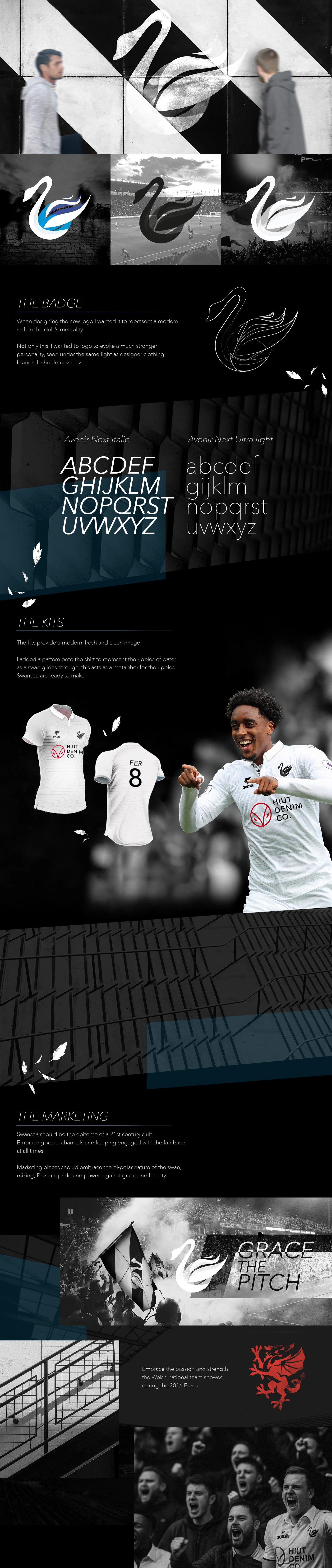
The concept centred around the symbol of the swan. I reimagined the clubs badge to show both elegance and strength. Using the golden rule to build a contemporary form that immediately appeals to the eye.
I built a brand structure that emanated elegance. With a monochrome palette and overlaying transparent forms and shapes.
The tagline “Grace the Pitch” pulling in the history and pride in which it is to represent this club. Feeling as powerful for the players as it does for the fans in the stands.