-
Most grocery chains talk about convenience, but do they really make your life simpler?
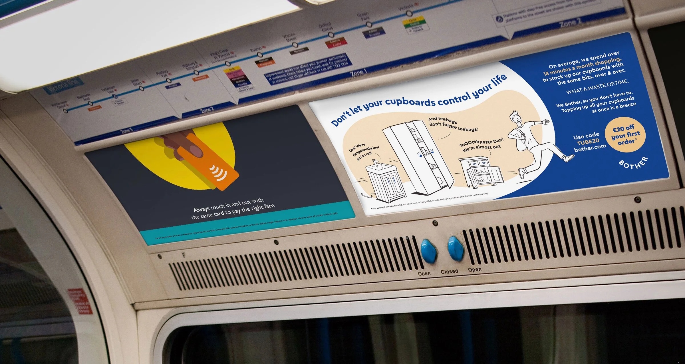
Shopping wastes 18 hours a month, buying the same items over and over, sitting in long queues, having your shopping chucked at you once you’ve finished.
Online shopping promised us ease, but we sit there endlessly scrolling, getting odd substitutions and costly delivery slots at the worst times. The mental load of keeping a household running is ignored by the industry. -
This friction between the brand and customer created issues of trust and attention.
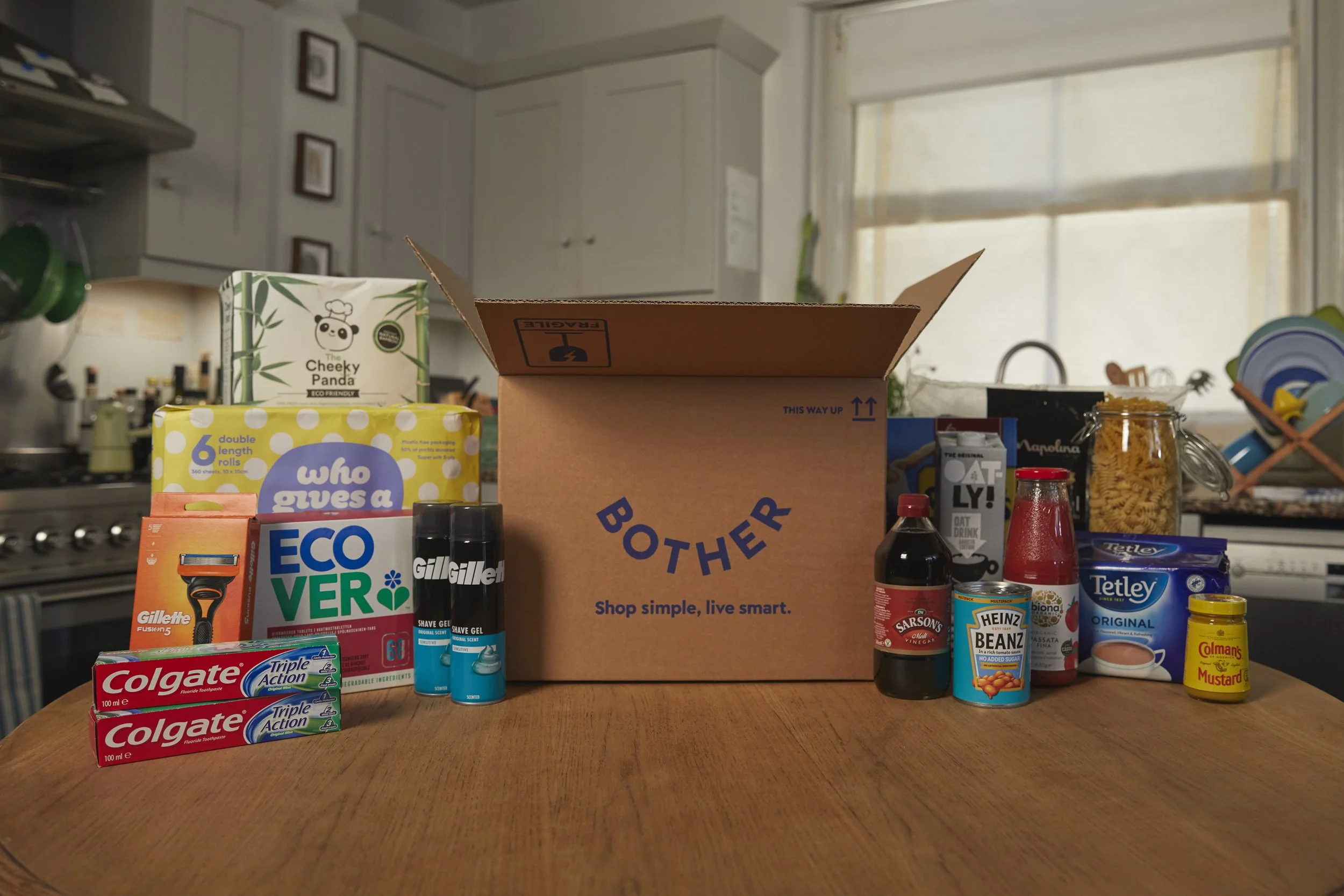
People didn’t need another place to buy toilet roll but somewhere that removed the everyday hassles of life.
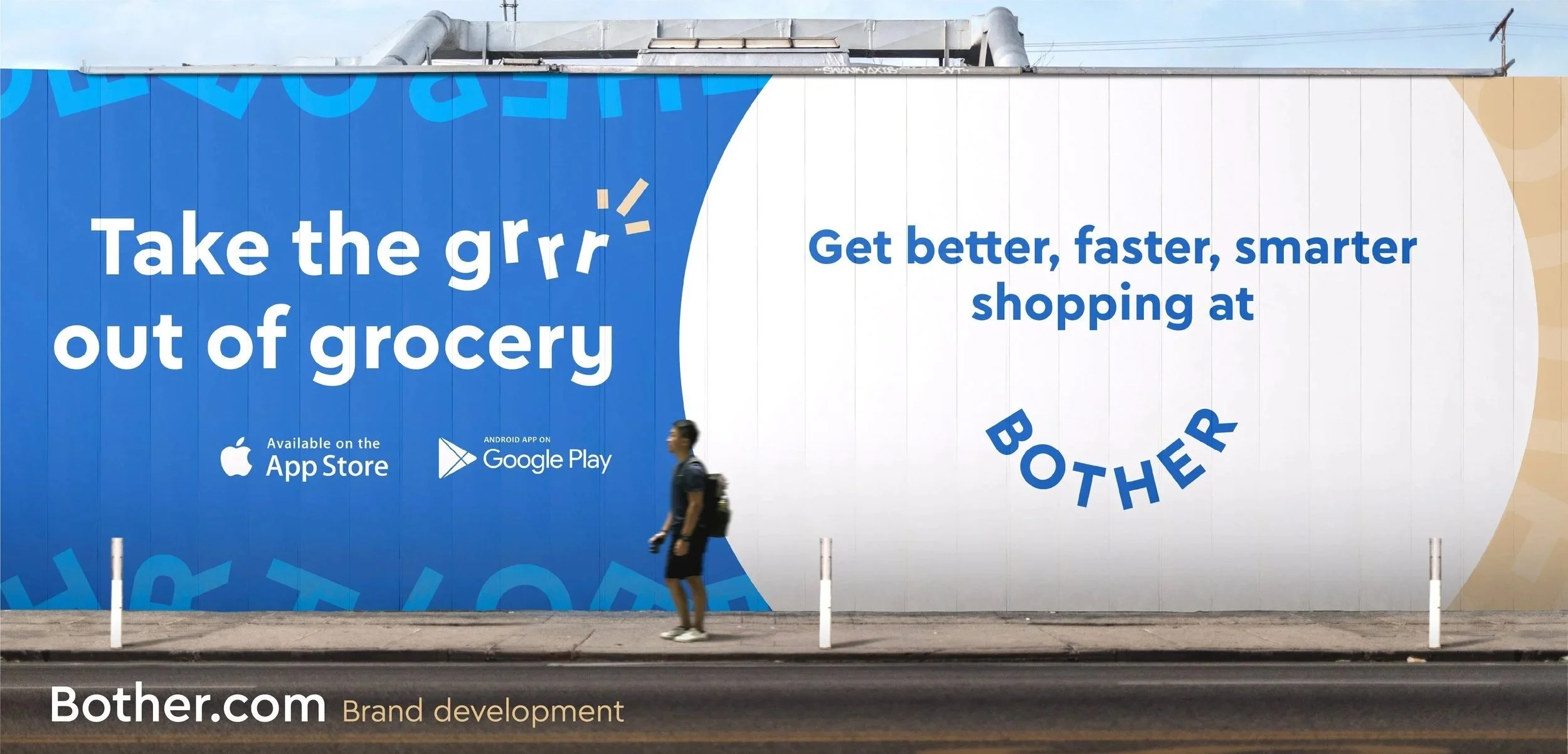
For Bother, this was an opportunity: to position themselves not as a supermarket but a time-saving brand that genuinely gives people back their hours. For the better things in life. -
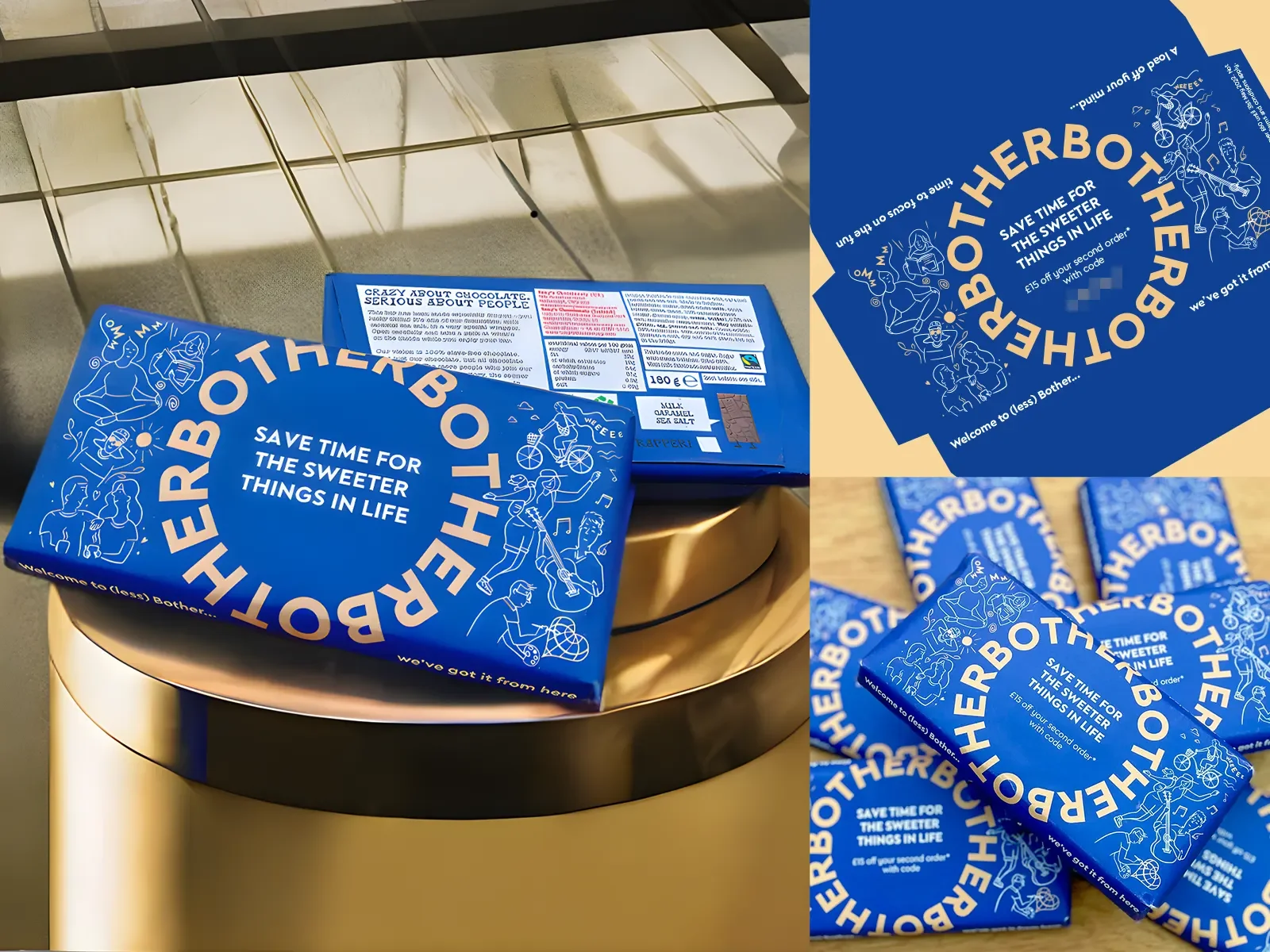
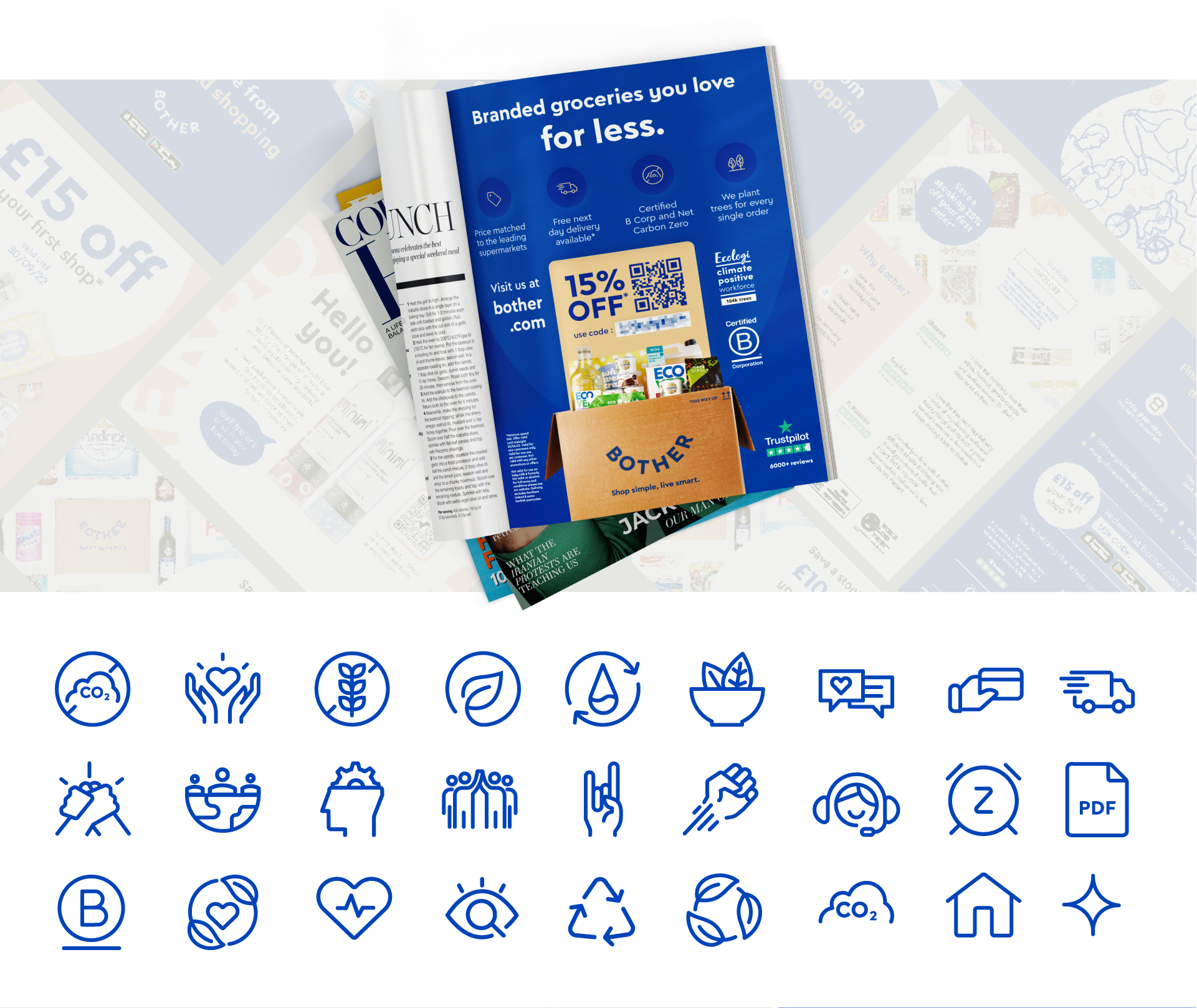
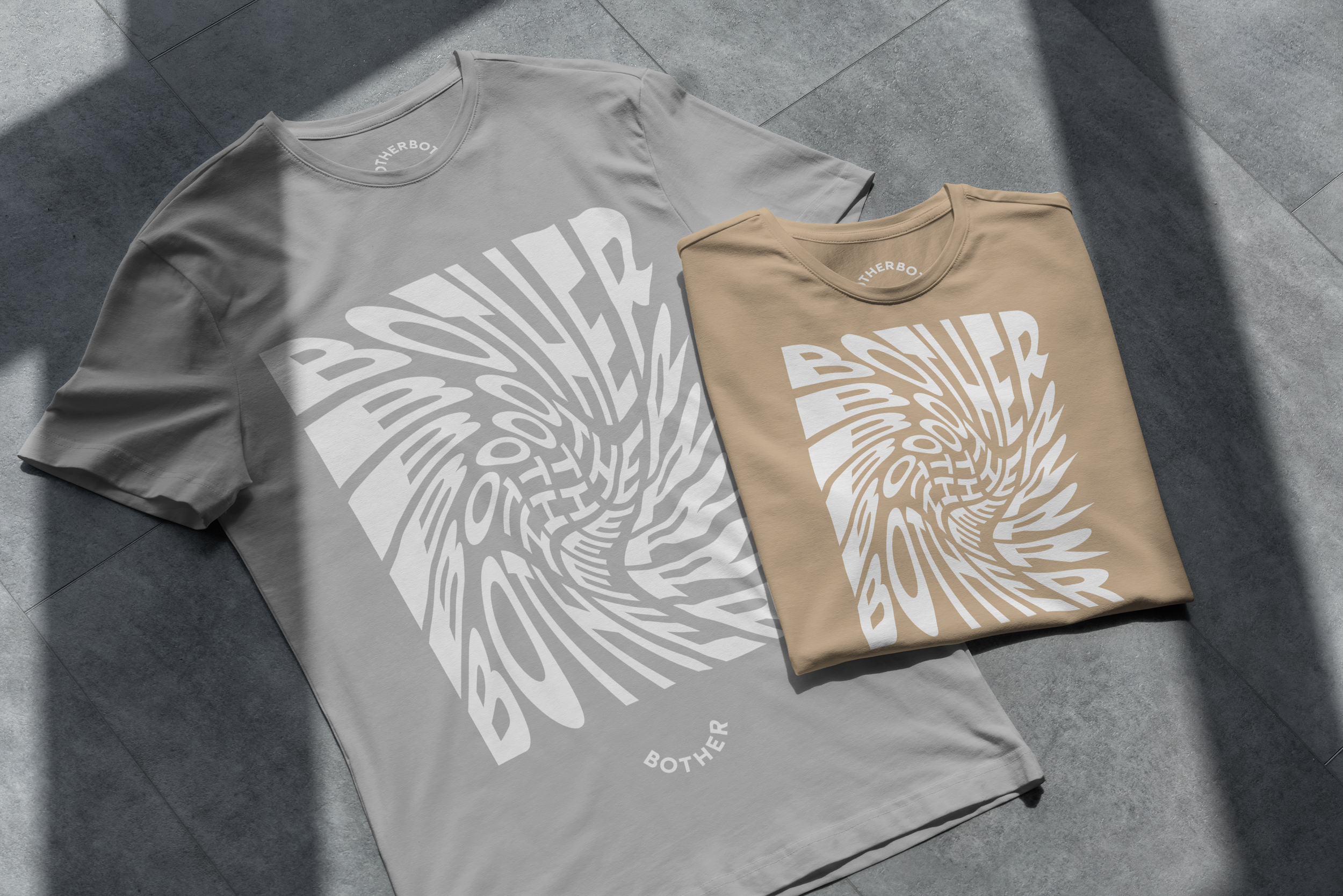
The brand focused on clarity, warmth and wit. As Lead Designer I ensured every design choice was reinforced with clean typography, spacious layouts, bright colours and a conversational tone of voice that felt human and grounded.
We understood that each touchpoint was important to building the brand that reflected Bother’s mission to simplify life, not overcomplicate it.
Motion was our storytelling device, introduced to create calming and rhythmic visuals that contrasted against the chaos of traditional shopping. Overall the system became bold but simple, scalable across our packaging, print, digital experiences and web UI.